
%20-%20https://sketch.com%20--%3e%3ctitle%3eT-shirts备份%202%3c/title%3e%3cdesc%3eCreated%20with%20Sketch.%3c/desc%3e%3cg%20id='T-shirts备份-2'%20stroke='none'%20stroke-width='1'%20fill='none'%20fill-rule='evenodd'%20transform='translate(0.000000,%201.000000)'%3e%3cg%20id='编组'%20transform='translate(1.000000,%2010.607599)'%20stroke='%23333333'%20stroke-width='2'%3e%3cpath%20d='M24.7506037,2.40561696%20L24.4109858,2.94791681%20C23.1539677,5.92351386%2021.831857,6.92184787%2018.472318,6.92184787%20C15.0918065,6.92184787%2013.7880665,5.90817694%2012.5599904,2.88704991%20C12.3847844,2.4561805%2012.0176189,2.13892356%2011.5768399,2.03613378%20C11.1481647,1.93340907%2010.6944147,2.05271913%2010.3590373,2.35903823%20L2.14473535,9.86550133%20C0.720776712,11.1696549%200.606481197,13.4202167%201.87710556,14.8789444%20L2.07276829,15.0840278%20C2.25830914,15.270309%202.47988147,15.4396542%202.72897579,15.5864188%20L7.32818819,18.2773511%20L7.28090871,18.9005194%20L6.25354816,32.4414343%20C6.21073375,32.9642561%206.44784527,33.473791%206.86639235,33.7641227%20C10.1405412,36.0536646%2013.3721888,37%2018.5296327,37%20C23.6951097,37%2026.9045107,36.0489513%2030.1280064,33.7695522%20L30.283246,33.6433265%20C30.6132328,33.3345129%2030.7846536,32.871259%2030.7355391,32.4039313%20L29.3432358,18.2472635%20L29.9205868,17.9293432%20L34.180155,15.5837978%20C35.172928,15.0358955%2035.8462157,14.0242248%2035.9766588,12.8762784%20C36.1078384,11.7218503%2035.6805042,10.5744842%2034.8363688,9.80961913%20L26.6326031,2.35780292%20C26.2994807,2.05668927%2025.8445706,1.93608725%2025.4144091,2.03482553%20C25.1685409,2.08962871%2024.9357839,2.22011465%2024.7506037,2.40561696%20Z'%20id='路径'%20fill-rule='nonzero'%3e%3c/path%3e%3cpath%20d='M32.0227213,7.12706337%20C34.1435585,6.79908718%2035.5589604,6.0103637%2036.2689268,4.76089296%20C36.7450972,3.92288014%2037.1241904,3.15623869%2037.4062064,2.46096862%20C37.6137918,1.94917626%2038.1969662,1.70257588%2038.7087556,1.91016839%20C38.8174691,1.95426485%2038.9175753,2.01714687%2039.0044951,2.09593814%20L47.0583283,9.39659336%20L47.7193116,10.1076368%20C49.0578159,11.5475138%2048.9756371,13.7998368%2047.5357601,15.1383411%20C47.3875203,15.2761442%2047.2277976,15.4010531%2047.0583283,15.5117097%20L41.9602936,18.3560999%20L43.2627471,32.7848946%20C43.2911962,33.0999871%2043.168856,33.4099546%2042.932878,33.6206843%20C42.6875325,33.8397791%2042.4886172,34.0097554%2042.3361319,34.1306133%20C39.7263264,36.1991123%2036.3979867,37.2333618%2032.3511128,37.2333618%20C28.7945467,37.2333618%2026.1316404,36.9623653%2024.3623939,36.4203724'%20id='路径-2'%20stroke-linecap='round'%3e%3c/path%3e%3c/g%3e%3cpath%20d='M33.4666494,4%20C32.7228105,4%2032.5,6.59294054%2031.8988718,7.11217576%20C31.2977436,7.63141098%2029.4332988,7.40648891%2029.4332988,8.12452017%20C29.4332988,8.84255143%2031.2477079,9.14206726%2031.8988718,9.8748333%20C32.5500357,10.6075994%2032.7509178,13.450957%2033.4666494,13.450957%20C34.182381,13.450957%2034.3969063,10.4640601%2034.8062404,9.8748333%20C35.2155745,9.28560653%2037.2689268,8.78824215%2037.2689268,8.12452017%20C37.2689268,7.46079818%2035.2474011,7.64545819%2034.8062404,7.11217576%20C34.3650797,6.57889333%2034.2104883,4%2033.4666494,4%20Z'%20id='路径-14'%20fill='%23333333'%3e%3c/path%3e%3c/g%3e%3c/svg%3e)
'%20stroke-linejoin='round'%3e%3cg%20id='编组'%20transform='translate(9.000000,%207.000000)'%20fill-rule='nonzero'%20stroke='%23333333'%20stroke-width='2'%3e%3cpath%20d='M31.6580999,-0.102439008%20C30.5100269,2.18823585%2030.0542426,5.67474993%2030.3587763,9.42418424%20C30.6822663,13.3951973%2031.8077846,17.2494259%2033.4717621,19.9872374%20L33.4717621,19.9872374%20L33.4717621,40.5126294%20L-1,40.5126294%20L-1,19.9934791%20C0.658093371,17.2553578%201.78946921,13.4009517%202.11296635,9.42985083%20C2.41752353,5.68012736%201.96173463,2.19367658%200.813663539,-0.0970116329%20L0.813663539,-0.0970116329%20L8.12511393,-0.0970116329%20C7.93029031,2.82458939%208.80601437,5.51057742%2010.5050219,7.35259165%20C11.911224,8.87715484%2013.8817335,9.80794816%2016.2358811,9.80794816%20C18.5896257,9.80794816%2020.5597831,8.8761884%2021.9658812,7.35090274%20C23.6654197,5.50730309%2024.5415191,2.81937778%2024.3466448,-0.102439008%20L24.3466448,-0.102439008%20Z'%20id='路径'%3e%3c/path%3e%3cline%20x1='0'%20y1='35.5434153'%20x2='33.3493773'%20y2='35.5434153'%20id='路径-5'%3e%3c/line%3e%3cpath%20d='M7.02092154,-7.10542736e-15%20C10.1319066,2.93766424%2013.2035597,4.40649636%2016.2358811,4.40649636%20C19.2682024,4.40649636%2022.2974375,2.93766424%2025.3235864,-7.10542736e-15'%20id='路径-7'%20stroke-linecap='round'%3e%3c/path%3e%3cpath%20d='M31.4953977,2.63284558%20L36.4771799,2.61608223%20C35.6927912,8.39179041%2036.7632888,14.5260803%2039.6886728,21.018952%20L39.6886728,39.4218217%20L34.3249871,39.4218217'%20id='路径-9'%20stroke-linecap='round'%3e%3c/path%3e%3c/g%3e%3c/g%3e%3c/svg%3e)
'%3e%3cpath%20d='M19.7354789,3.20880828%20C19.7605297,5.17861174%2020.6448662,6.94071017%2022.0295594,8.13965347%20C23.1932709,9.14725872%2024.711067,9.75671011%2026.3711606,9.75671011%20C28.0312542,9.75671011%2029.5490503,9.14725872%2030.7127618,8.13965347%20C31.8921595,7.11846622%2032.7085685,5.68873246%2032.9402054,4.07008582%20C32.9791132,3.79820377%2033.0006898,3.52681041%2033.0059749,3.25726284%20C33.3088406,3.22718757%2033.6170537,3.21177646%2033.9300294,3.21174794%20C36.1624168,3.21154457%2038.1526409,3.99399935%2039.6884369,5.29843532%20C41.2675336,6.63964892%2042.3676941,8.53665197%2042.7454691,10.7166588%20L42.7454691,10.7166588%20L46.1709196,41.7693318%20C46.247944,42.3321697%2046.0859691,42.8829051%2045.7084154,43.3183964%20C45.3612167,43.722187%2044.8663578,43.9753491%2044.3260734,44.0229386%20L44.3260734,44.0229386%20L39.8040277,44.0310553%20C39.3781173,44.0310553%2038.9829429,43.8965525%2038.6635982,43.6700095%20C38.3024986,43.4138456%2038.038002,43.0403296%2037.9249985,42.6039024%20L37.9249985,42.6039024%20L37.6832738,41.0277321%20C37.0157385,42.0213966%2035.9570908,42.6391292%2034.7706802,42.7062063%20L34.7706802,42.7062063%20L16.8781526,42.7122292%20C15.6665116,42.7122292%2014.5474319,42.1274244%2013.8744406,41.1564779%20L13.8744406,41.1564779%20L13.5787457,42.5263987%20C13.4931715,42.9254624%2013.2806044,43.2768413%2012.9822705,43.540301%20C12.6774394,43.8094984%2012.2828471,43.9856112%2011.8527165,44.0228058%20L11.8527165,44.0228058%20L7.2966742,44.0301767%20C6.68507413,44.0301767%206.11615304,43.7675926%205.72859965,43.3188465%20C5.38697876,42.9229494%205.22291954,42.434758%205.24956026,41.9304278%20L5.24956026,41.9304278%20L9.114459,10.9787644%20C9.43354023,8.78714507%2010.4574643,6.866184%2011.9617204,5.48365114%20C13.439357,4.12558378%2015.381771,3.28220853%2017.5931807,3.21561749%20L17.5931807,3.21561749%20Z'%20id='形状结合'%20stroke='%23333333'%20stroke-width='2'%20stroke-linejoin='round'%20fill-rule='nonzero'%3e%3c/path%3e%3cline%20x1='14.9471931'%20y1='16.0295055'%20x2='13.8670819'%20y2='43.1333598'%20id='路径-2'%20stroke='%23333333'%20stroke-width='2'%20stroke-linejoin='round'%20fill-rule='nonzero'%3e%3c/line%3e%3cline%20x1='37.6587671'%20y1='16.0295055'%20x2='36.567858'%20y2='43.1333598'%20id='路径-2备份'%20stroke='%23333333'%20stroke-width='2'%20stroke-linejoin='round'%20fill-rule='nonzero'%20transform='translate(37.113313,%2029.581433)%20scale(-1,%201)%20translate(-37.113313,%20-29.581433)%20'%3e%3c/line%3e%3cpath%20d='M4.14236007,0%20C3.37841745,0%203.14958501,2.66302001%202.53221008,3.19628862%20C1.91483515,3.72955722%200,3.49855617%200,4.23599369%20C0,4.9734312%201.86344714,5.28104205%202.53221008,6.03361258%20C3.20097302,6.78618312%203.4072844,9.70638822%204.14236007,9.70638822%20C4.87743575,9.70638822%205.09775907,6.6387644%205.51815625,6.03361258%20C5.93855342,5.42846076%208.04740171,4.9176541%208.04740171,4.23599369%20C8.04740171,3.55433327%205.97124022,3.74398409%205.51815625,3.19628862%20C5.06507227,2.64859315%204.9063027,0%204.14236007,0%20Z'%20id='路径-14'%20fill='%23333333'%3e%3c/path%3e%3cline%20x1='6.44444444'%20y1='38.3089431'%20x2='13.2552553'%20y2='38.3089431'%20id='路径-3'%20stroke='%23333333'%20stroke-width='2'%20stroke-linejoin='round'%20fill-rule='nonzero'%3e%3c/line%3e%3cline%20x1='38'%20y1='38.3089431'%20x2='45.8108108'%20y2='38.3089431'%20id='路径-3备份'%20stroke='%23333333'%20stroke-width='2'%20stroke-linejoin='round'%20fill-rule='nonzero'%3e%3c/line%3e%3c/g%3e%3c/g%3e%3c/svg%3e)
'%3e%3cpath%20d='M34.9261439,0%20C34.1622012,0%2033.9333688,2.66302001%2033.3159939,3.19628862%20C32.6986189,3.72955722%2030.7837838,3.49855617%2030.7837838,4.23599369%20C30.7837838,4.9734312%2032.6472309,5.28104205%2033.3159939,6.03361258%20C33.9847568,6.78618312%2034.1910682,9.70638822%2034.9261439,9.70638822%20C35.6612195,9.70638822%2035.8815429,6.6387644%2036.30194,6.03361258%20C36.7223372,5.42846076%2038.8311855,4.9176541%2038.8311855,4.23599369%20C38.8311855,3.55433327%2036.755024,3.74398409%2036.30194,3.19628862%20C35.8488561,2.64859315%2035.6900865,0%2034.9261439,0%20Z'%20id='路径-14'%20fill='%23333333'%3e%3c/path%3e%3cpath%20d='M18.4864865,7.18963854%20C15.4758095,7.17353458%2011.6765338,8.43151301%209.29444611,11.1321905%20C6.91235846,13.832868%201.25126095,20.2672047%200.387510052,31.5103084%20C-0.188323879,39.0057108%20-0.122397588,42.4815693%200.585288924,41.9378837%20L5.35517862,43.1351351%20C6.49874742,42.6940382%207.11008428,41.3246688%207.18918919,39.027027%20C10.964873,40.352122%2014.7306388,40.9373335%2018.4864865,40.7826614%20C22.2423342,40.6279893%2026.0080999,40.0943847%2029.7837838,39.1818475%20C30.1353835,41.4550539%2030.9437088,42.7728164%2032.2087597,43.1351351%20L35.97522,42.1868999%20C37.082045,41.6368999%2037.2680046,38.0780361%2036.5330988,31.5103084%20C35.4307401,21.6587169%2030.3374081,13.8085547%2027.6629466,11.1321905%20C24.9884851,8.45582629%2021.4971635,7.2057425%2018.4864865,7.18963854%20Z'%20id='路径-2'%20stroke='%23333333'%20stroke-width='2'%20stroke-linejoin='round'%20fill-rule='nonzero'%3e%3c/path%3e%3cpath%20d='M30.4824021,39.027027%20C29.7361521,36.2882883%2029.7873366,33.5495495%2030.6359556,30.8108108'%20id='路径-4'%20stroke='%23333333'%20stroke-width='2'%20stroke-linecap='round'%20stroke-linejoin='round'%20fill-rule='nonzero'%20transform='translate(30.297297,%2034.918919)%20scale(-1,%201)%20translate(-30.297297,%20-34.918919)%20'%3e%3c/path%3e%3cpath%20d='M18.5081607,1.02702703%20C23.5904804,1.02702703%2028.8837764,7.80750772%2027.5089127,10.5572351%20C26.1340491,13.3069625%2011.044553,13.6315238%209.50740862,10.5572351%20C7.97026429,7.48294643%2013.4258409,1.02702703%2018.5081607,1.02702703%20Z'%20id='矩形'%20stroke='%23333333'%20stroke-width='2'%20stroke-linejoin='round'%20fill-rule='nonzero'%3e%3c/path%3e%3cpath%20d='M14.2487482,28.9937363%20C14.9334329,27.7204903%2015.1527269,26.6144701%2014.9066303,25.6756757%20L22.1744145,25.6756757%20C22.1611041,26.952086%2022.3983129,28.0581062%2022.8860409,28.9937363%20C23.3737689,29.9293664%2024.1722123,30.8774003%2025.2813711,31.8378378%20L24.6486486,35.9459459%20C22.5945946,36.4426461%2020.5405405,36.6909962%2018.4864865,36.6909962%20C16.4324324,36.6909962%2014.3783784,36.4426461%2012.3243243,35.9459459%20L11.6895463,31.8378378%20C12.7109962,31.2150162%2013.5640635,30.2669823%2014.2487482,28.9937363%20Z'%20id='矩形'%20stroke='%23333333'%20stroke-width='2'%20stroke-linecap='round'%20stroke-linejoin='round'%20fill-rule='nonzero'%3e%3c/path%3e%3cpath%20d='M6.8607805,39.027027%20C6.11453049,36.2882883%206.16571499,33.5495495%207.014334,30.8108108'%20id='路径-4'%20stroke='%23333333'%20stroke-width='2'%20stroke-linecap='round'%20stroke-linejoin='round'%20fill-rule='nonzero'%3e%3c/path%3e%3c/g%3e%3c/g%3e%3c/svg%3e)
'%20fill-rule='nonzero'%20stroke='%23333333'%20stroke-width='2'%3e%3cpath%20d='M30.2050905,-0.0716765239%20C30.6708724,-0.020568619%2031.0989537,0.0686601335%2031.483746,0.196177499%20C33.6750695,0.92236607%2036.250887,3.48295379%2038.4018553,7.23671243%20C40.2937276,10.5383101%2041.8772238,14.7414509%2042.6174967,19.2400665%20C43.3015193,23.3968505%2043.7565804,28.9686602%2043.9784178,35.9547829%20C44.0400516,36.4969187%2043.8781366,37.0250522%2043.5140054,37.4450611%20C43.2062203,37.8030139%2042.7813981,38.041594%2042.3119771,38.1218049%20L42.3119771,38.1218049%20L37.9607078,39.444336%20C37.4726975,39.4862166%2037.0161903,39.348771%2036.6566164,39.0936894%20C36.3026307,38.8425722%2036.0422434,38.4777692%2035.9279386,38.0514231%20L35.9279386,38.0514231%20L35.6512065,36.5336709%20C35.0300844,37.3677575%2030.555744,39.4518537%2024.4058776,39.4509091%20C18.2992611,39.4499711%2014.4288377,37.4473381%2013.778979,36.6481801%20L13.778979,36.6481801%20L13.4946346,37.9590944%20C13.409733,38.3550217%2013.1988587,38.7036554%2012.9028653,38.9650483%20C12.5531444,39.2738881%2012.0843057,39.4592101%2011.5795724,39.4506141%20L11.5795724,39.4506141%20L6.83733744,37.7838851%20C6.30688108,37.734067%205.8219314,37.4841832%205.47966262,37.0878719%20C5.10475105,36.6533949%204.94361938,36.1075601%205.01987087,35.5487108%20C5.87952927,27.1575901%206.62275357,21.5194236%207.24381867,18.6331488%20C8.15689051,14.3898316%2010.0567274,9.62710944%2012.2478489,6.01913378%20C14.4198269,2.44268049%2016.9155321,0.126020223%2019.0038476,-0.0341941814%20C19.3349904,-0.059599273%2019.684528,-0.0329792934%2020.048933,0.0426727475%20C20.0485026,0.322038007%2020.0587709,0.606972386%2020.0781127,0.89613626%20C20.1906468,2.57854425%2020.5885245,4.07814763%2021.5538567,5.09082243%20C22.3562527,5.93257014%2023.5496125,6.39100896%2025.2079599,6.39100896%20C26.8232274,6.39100896%2027.9750703,5.95750793%2028.7455387,5.15028431%20C29.680592,4.17062417%2030.0530617,2.7130328%2030.1717874,1.07319992%20C30.200092,0.68225832%2030.2126331,0.299489175%2030.2050905,-0.0716765239%20Z'%20id='形状结合'%3e%3c/path%3e%3cpath%20d='M19.5133106,0%20C21.3811567,1.7116825%2022.6015035,2.13363743%2025.1288966,2.13363743%20C27.6562896,2.13363743%2028.7112206,1.7116825%2031.0265736,0'%20id='路径-7'%20stroke-linecap='round'%3e%3c/path%3e%3cpath%20d='M14.2776845,37.1340996%20C13.4265244,34.2247524%2013.6221502,31.1532826%2014.63166,28.1550842'%20id='路径-4'%20stroke-linecap='round'%3e%3c/path%3e%3cpath%20d='M35.6114473,37.1340996%20C34.7602872,34.2247524%2034.955913,31.1532826%2035.9654228,28.1550842'%20id='路径-4备份'%20stroke-linecap='round'%20transform='translate(35.520490,%2032.644592)%20scale(-1,%201)%20translate(-35.520490,%20-32.644592)%20'%3e%3c/path%3e%3cpath%20d='M15.6089327,1.73235424%20C14.8279907,1.73235424%2013.5856023,1.15490283%2011.8817673,-5.68434189e-14%20C5.88636871,6.20145775%202.28312945,13.1925875%201.07204948,20.9733893%20C-0.139030491,28.754191%20-0.190632326,32.961664%200.917243972,33.5958082%20L4.99556447,35.210175'%20id='路径-2'%20stroke-linecap='round'%3e%3c/path%3e%3c/g%3e%3cpath%20d='M25.5592019,34.3180607%20C26.2438866,33.0448147%2026.4631806,31.9387944%2026.217084,31%20L33.4848682,31%20C33.4715578,32.2764103%2033.7087666,33.3824305%2034.1964946,34.3180607%20C34.6842225,35.2536908%2035.4826659,36.2017246%2036.5918248,37.1621622%20L35.9591023,41.2702703%20C33.9050483,41.7669705%2031.8509942,42.0153206%2029.7969402,42.0153206%20C27.7428861,42.0153206%2025.6888321,41.7669705%2023.634778,41.2702703%20L23,37.1621622%20C24.0214499,36.5393405%2024.8745172,35.5913066%2025.5592019,34.3180607%20Z'%20id='矩形'%20stroke='%23333333'%20stroke-width='2'%20stroke-linecap='round'%20fill-rule='nonzero'%3e%3c/path%3e%3c/g%3e%3c/svg%3e)
'%20fill-rule='nonzero'%20stroke='%23333333'%20stroke-linejoin='round'%20stroke-width='2'%3e%3cpath%20d='M23.9621848,47.8189278%20C23.5302392,47.8189278%2023.1846827,47.5165659%2023.0982935,47.0846203%20L19.2107828,24.2778909%20L15.3232721,47.0846203%20C15.236883,47.5165659%2014.8913265,47.8189278%2014.4593809,47.8189278%20L1.26379866,47.8189278%20C1.00463128,47.8189278%200.788658489,47.7325387%200.615880175,47.5165659%20C0.44310192,47.3437877%200.356712793,47.0846203%200.399907386,46.8254529%20C1.6957443,32.7872199%204.15783439,5.79061781%204.15783439,4.23561352%20L4.15783439,3.5445005%20L4.15783439,1.29838325%20C4.15783439,0.823243081%204.54658544,0.434491979%205.02172561,0.434491979%20L33.8629155,0.434491979%20C34.3380556,0.434491979%2034.7268067,0.823243022%2034.7268067,1.29838325%20L34.7268067,4.14922439%20C35.4611143,9.4189611%2038.35515,45.3136432%2038.4847338,46.8254529%20C38.4847338,47.0846203%2038.4415392,47.3005931%2038.2687609,47.5165659%20C38.0959826,47.6893442%2037.8800099,47.8189278%2037.6208425,47.8189278%20L23.9621848,47.8189278%20Z'%20id='路径'%3e%3c/path%3e%3cpath%20d='M12.2091913,7.64705882%20C13.2588301,14.6696078%2010.1386094,18.1808824%202.84852941,18.1808824'%20id='路径-8'%3e%3c/path%3e%3cpath%20d='M36.6606619,7.64705882%20C37.7103006,14.6696078%2034.59008,18.1808824%2027.3,18.1808824'%20id='路径-8备份'%20transform='translate(32.079412,%2012.913971)%20scale(-1,%201)%20translate(-32.079412,%20-12.913971)%20'%3e%3c/path%3e%3cline%20x1='4.36015661'%20y1='6.85020053'%20x2='35.4250589'%20y2='6.85020053'%20id='路径-7'%3e%3c/line%3e%3cline%20x1='22.9411765'%20y1='43.0147059'%20x2='38.2352941'%20y2='43.0147059'%20id='路径-3备份'%3e%3c/line%3e%3cline%20x1='0.955882353'%20y1='43.0147059'%20x2='16.25'%20y2='43.0147059'%20id='路径-3备份-2'%3e%3c/line%3e%3c/g%3e%3cpath%20d='M6.14236007,5%20C5.37841745,5%205.14958501,7.66302001%204.53221008,8.19628862%20C3.91483515,8.72955722%202,8.49855617%202,9.23599369%20C2,9.9734312%203.86344714,10.281042%204.53221008,11.0336126%20C5.20097302,11.7861831%205.4072844,14.7063882%206.14236007,14.7063882%20C6.87743575,14.7063882%207.09775907,11.6387644%207.51815625,11.0336126%20C7.93855342,10.4284608%2010.0474017,9.9176541%2010.0474017,9.23599369%20C10.0474017,8.55433327%207.97124022,8.74398409%207.51815625,8.19628862%20C7.06507227,7.64859315%206.9063027,5%206.14236007,5%20Z'%20id='路径-14'%20fill='%23333333'%3e%3c/path%3e%3c/g%3e%3c/svg%3e)
'%20fill-rule='nonzero'%20stroke='%23333333'%20stroke-width='2'%3e%3cpath%20d='M33.0403779,3.78231646%20C33.3707049,3.78231646%2033.6611649,4.12340341%2033.7295084,4.6094523%20C33.9402343,6.02496304%2034.1224837,11.3518882%2034.3104284,12.7759262%20L34.3104284,12.7759262%20L34.2695566,12.7765763%20C35.9295803,22.1661353%2036.8219297,30.5371284%2036.5177248,40.2716845%20L36.5177248,40.2716845%20L36.4949436,41.0291585%20L20.6164655,41.0291585%20L18.3311855,27.8254864%20C18.2913184,27.546417%2017.8926479,27.546417%2017.8527808,27.8254864%20L17.8527808,27.8254864%20L16.0602308,41.0291585%20L0.181752703,41.0291585%20L0.158971523,40.2716845%20C-0.146886806,30.6582401%200.297947405,22.3663342%201.86201358,13.1114332%20L1.91967082,12.7759262%20C2.10761547,11.3518882%202.28986491,6.02496304%202.50059073,4.6094523%20C2.57462954,4.12340341%202.85939423,3.78231646%203.18972123,3.78231646%20L3.18972123,3.78231646%20Z'%20id='形状结合'%3e%3c/path%3e%3cpath%20d='M9.07993884,12.1521737%20C10.0037613,17.7608692%207.25754983,20.5652169%200.841304326,20.5652169'%20id='路径-8'%3e%3c/path%3e%3cpath%20d='M35.1603729,12.1521737%20C36.0841954,17.7608692%2033.3379839,20.5652169%2026.9217384,20.5652169'%20id='路径-8备份'%20transform='translate(31.128260,%2016.358695)%20scale(-1,%201)%20translate(-31.128260,%20-16.358695)%20'%3e%3c/path%3e%3cline%20x1='17.9014823'%20y1='11.588091'%20x2='17.9014823'%20y2='19.9970733'%20id='路径-2'%20stroke-linecap='round'%3e%3c/line%3e%3cline%20x1='2.3484169'%20y1='11.588091'%20x2='34.3104284'%20y2='11.588091'%20id='路径-7'%3e%3c/line%3e%3cline%20x1='33.8721372'%20y1='9.34782609'%20x2='39.4402724'%20y2='9.34782609'%20id='路径-7备份'%3e%3c/line%3e%3cpath%20d='M37.5114243,38.2801333%20L42.0652174,38.2801333%20C42.8222165,31.1294628%2042.0652174,19.9970733%2039.7482269,10.8705978%20L38.8648884,0.904789217%20C38.8243442,0.420447683%2038.4193994,0.0479844782%2037.9333638,0.0479844782%20L9.67260658,0.0479844782%20C9.1563404,0.0479844782%208.73782397,0.466500908%208.73782397,0.982767087%20L8.73782397,3.73913043'%20id='路径-10'%3e%3c/path%3e%3c/g%3e%3c/g%3e%3c/svg%3e)



Vintage t shirt printing works when the garment finish, base color, print surface, artwork texture, and decoration process create one controlled worn-in direction. A distressed graphic alone cannot make a clean modern blank look convincingly vintage, and an aggressive wash can weaken contrast or expose print problems that were hidden on the first sample.
For streetwear brands and graphic apparel teams, the commercial decision is therefore broader than choosing a faded filter. Buyers must define what kind of age the product should communicate, select a blank that supports it, and approve a physical print after the intended finishing and care cycle. Washed products can show reasonable shade and surface variation, so the production standard should identify an acceptable range instead of promising that every unit will look identical. The goal is a repeatable design language that still protects readability, hand feel, garment shape, and reorder control.
What Creates a Worn In Print Without Looking Defective?
A convincing worn-in print needs deliberate variation that follows the artwork and garment, while a defect looks accidental or obstructs the message. The buyer should define where color loss, texture, softness, edge wear, and garment variation are acceptable before the supplier prepares a sample.
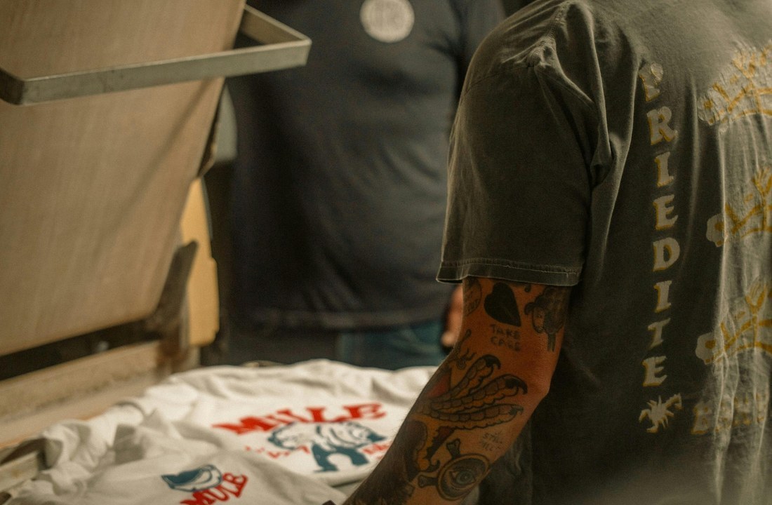
Separate print aging from garment washing
Print aging is created inside the graphic through controlled gaps, reduced coverage, halftone texture, softened edges, restrained color, or a process that lets the fabric influence the image. Garment washing changes the blank itself. It can affect shade, surface, seams, dimensional stability, and the relationship between ink and fabric. Either approach can support a vintage direction, but they solve different visual problems.
A clean blank with distressed artwork can produce a graphic-led retro look. That route may be appropriate when the brand wants consistent garment color and puts most of the character in the illustration. A washed blank creates age across the whole product and may better support faded color, softened surface, or high-low effects around seams. It also introduces more variables. The CottonWorks garment finishing overview explains that finishing can involve washing, abrasion, softening, discharge, overdyeing, and other processes, while common wash names do not always describe one universal sequence. Buyers should therefore request the actual finishing description, not approve a product from the words “acid wash” or “stone wash” alone.
The two approaches can also conflict. A detailed distressed graphic may become weak on a strongly mottled garment because both the blank and the print compete for visual texture. A high-coverage print may appear too new on a heavily washed body. Test the combined product rather than approving the garment and artwork as separate digital files.
Write an acceptance standard for intentional variation
Describe the intended result in observable terms. Identify the target base shade, contrast level, amount and distribution of graphic breakup, edge definition, visible fabric contribution, and whether the print should feel smooth, soft, textured, or substantial. Reference photographs can communicate direction, but a signed physical sample should become the production control because screens and lighting alter apparent color.
Define what cannot vary. Legibility, artwork location, registration between colors, minimum detail, garment measurements, holes, stains, unwanted creases, and print adhesion should not be excused as “vintage.” For garment-washed products, decide how much light-to-dark shade movement, seam highlighting, speckling, and unit-to-unit difference the brand can sell without classifying an item as off-standard. If the team cannot explain that boundary to inspection staff, the aesthetic is not ready for production.
Keep one approved sample and dated photographs under consistent lighting. Add a written tolerance description for the wash and a separate defect list for printing. This prevents the supplier from treating every variation as acceptable and prevents the buyer from rejecting intentional wash character that was present in the approved sample.
Which Blank Should Carry the Vintage Effect?
The blank should be selected by fit, fabric construction, weight, color, surface, finishing route, and print compatibility, not by the word “vintage” in a product name. A blank that photographs well but changes shape, hides the artwork, or conflicts with the target season can undermine the entire range.
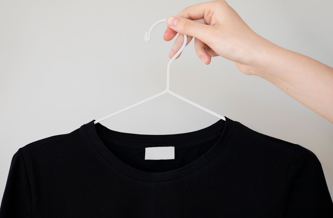
Compare a washed blank with a clean control
A washed blank gives the garment immediate visual history. The 285GSM heavyweight snow-wash boxy-fit T-shirt is a relevant current product direction when a substantial silhouette and visible wash character suit the brief. Its named weight, wash, and fit do not prove that every vintage graphic or print method will work on it. The exact color, surface, artwork, placement, and sample still require review.
Use an unwashed or less visibly washed blank as a control when the graphic should create most of the age. The 305GSM earth-tone drop-shoulder T-shirt offers a different product direction for comparing silhouette and base color without treating it as a washed equivalent. A heavier named GSM does not automatically make a better printing surface, and the two products should not be compared by weight alone.
Order both candidates in the intended color when the commercial choice is unclear. Apply the same artwork at the same scale, then compare from a normal viewing distance and close range. If the washed surface reduces important detail, simplify the art or choose the cleaner base. If the clean garment makes the print feel isolated, introduce controlled artwork texture or reconsider the blank finish.
Evaluate fabric surface and fit as part of the graphic
Fiber content matters, but it is not the complete print specification. Knit structure, yarn character, surface hair, compactness, stretch, pre-treatment, dye or pigment behavior, and prior finishing can change how ink sits, bonds, or appears. The T-shirt fabric selection guide can help frame fabric questions, while the supplier must still confirm the actual blank and decoration combination.
Fit changes the way a graphic is read. A boxy body can support a broad chest or back image, but a large design may wrap toward the armhole on smaller sizes. A drop shoulder shifts the visual boundary between body and sleeve. Cropped, oversized, and longline proportions alter placement even when the print dimensions stay unchanged. Approve the design on at least the sizes that create the greatest placement risk rather than relying on one central mockup.
Base color also participates in the print. Faded black, washed charcoal, earth tones, and bright pigments change perceived contrast. White ink may appear sharper than intended on a dark washed blank, while a low-contrast tonal design can disappear under retail lighting. If the garment has mottled areas, check the artwork over both lighter and darker zones. A swatch cannot show how seams, panels, and full-body washing will affect the final visual balance.
How Should Artwork and Ink Build Controlled Age?
Artwork should create age through intentional texture that survives at production size, and the ink or transfer should support that texture without filling it back in. The buyer must approve separations, underbase strategy, line weight, color interaction, and final placement on the actual blank.
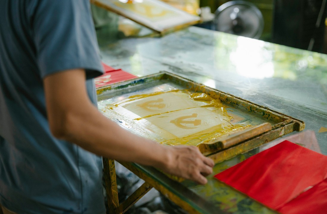
Build distress that belongs to the image
Random noise often looks like a software effect placed over finished art. Better distress follows the visual logic of the design: wear concentrates at large solid areas, edges soften selectively, and important faces, names, dates, or brand marks remain readable. Texture should change in scale and density rather than repeat as an obvious digital tile.
Prepare vector elements where clean control is required, and use suitable resolution for raster texture at final print size. Convert fonts or package them correctly, keep the editable master, and label every version. A mockup preview should not be the only production file because it hides separations, transparency, and detail that may close during output.
Check the design at actual size. Very small holes in a distressed field may fill with ink, pretreatment, transfer adhesive, or garment surface. Thin isolated marks may disappear after washing. Increase or remove details that cannot be reproduced reliably instead of asking the printer to guess. If several garment sizes use one print size, confirm whether the visual proportion remains intentional on both the smallest and largest bodies.
Control underbase color and fabric show-through
On dark garments, an underbase can strengthen upper colors and isolate the print from the blank. That may be useful for clarity, but an opaque underbase can make a vintage graphic look newer and heavier. Reducing coverage can let the fabric contribute to the image, yet insufficient support may cause muddy color or inconsistent readability across the wash.
Do not remove the underbase from every distressed area by default. Decide which colors need stability, which areas can intentionally reveal fabric, and how the result should change on lighter or darker garment zones. A cream graphic on faded black may need a different separation from a multicolor illustration on an earth-tone blank. The correct choice depends on the press process, ink system, garment color, and desired hand.
Ask for a print-ready proof that shows final dimensions, location, color plan, and any underbase or white-layer logic. Then approve the physical sample under neutral lighting. Digital color values cannot guarantee the appearance of ink over a washed textile, and a photograph cannot prove print thickness or softness.
How Do DTG DTF and Screen Printing Behave?
DTG, DTF, and screen printing can all produce a vintage-looking graphic, but they create different surface, setup, color, texture, and repeat-order conditions. Choose the process by the approved visual and commercial brief rather than assuming one method is always best for streetwear printed T shirts.
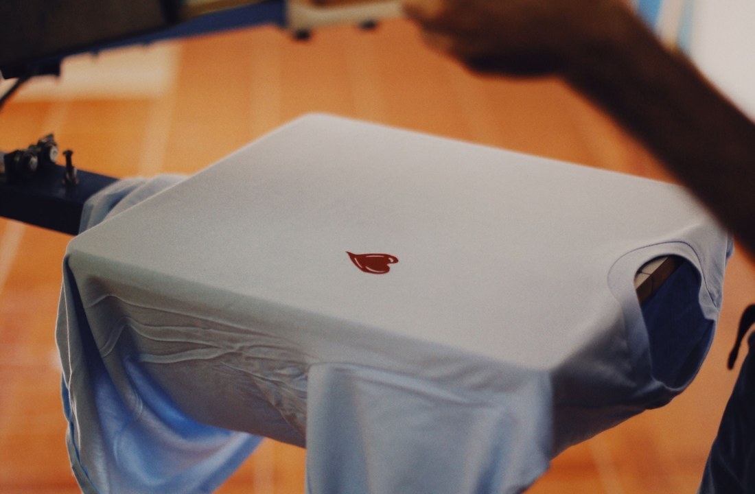
Match the process to artwork and order conditions
DTG can reproduce detailed raster texture and variable color without physical screens, which can suit artwork-led testing and smaller assortments. Results depend on the garment, pre-treatment, white-ink behavior, color profile, curing, and wash. A heavily textured surface or strong garment finish may alter fine detail, so the exact washed blank must be printed rather than represented by a clean substitute.
DTF can carry detailed artwork across a broad range of compatible garments, but the transfer layer and adhesive affect hand, stretch, edge behavior, and the way open distressed areas feel. A large solid transfer can conflict with a soft worn-in goal even if the visual texture is correct. Breakup in the artwork may reduce coverage, but extremely small isolated pieces must still transfer and wash reliably.
Screen printing provides direct control over separations, ink choice, mesh, underbase, and coverage. It can suit repeat orders and deliberately limited palettes, but setup, color count, registration, and minimum printable detail influence the commercial decision. Specialty inks or reduced-coverage techniques should be sampled; the word “vintage” does not define a formulation.
This comparison should be confirmed against the specific supplier and garment:
| Process | Useful when | Vintage control point | Mismatch to avoid |
|---|---|---|---|
| DTG | Detailed raster art and flexible testing matter | Pretreatment, white ink, profile, fabric show-through | Approving on a clean blank instead of the washed product |
| DTF | Detailed transfers and garment flexibility are needed | Coverage, adhesive, edge size, hand and stretch | Using a large solid transfer for a soft worn-in brief |
| Screen printing | Controlled separations and repeat production support the order | Underbase, ink deposit, mesh, distress scale | Sending texture too fine to hold consistently |
No row identifies a universal winner. The best choice is the process that can reproduce the approved texture on the intended blank, within the order structure and reorder plan. Ask the supplier to state what changes when artwork size, garment color, fabric, or quantity changes.
Use one approved route for repeat production
Record the blank code and color, artwork revision, print dimensions, placement reference, process, color separations, underbase approach, curing or application settings where available, and approved sample date. If a reorder moves to another blank or printer, treat the result as a new approval rather than expecting an old photograph to control it.
Review available custom apparel decoration options against the actual project, but do not infer a method, parameter, or guarantee that the page does not state. Submit the artwork and garment direction so the process can be checked for the real surface and order. A method name alone is not a quote and does not prove compatibility.
When screening product directions, the Cloprod apparel catalog can help the buyer identify current garment candidates. Keep the product link attached to the request so a similar-looking blank is not substituted silently. A change in color or finishing can be material even when the fit name stays the same.
What Must the Sample and Wash Test Approve?
The sample and wash test must approve the complete product after the intended print and garment finishing sequence. Visual character, dimensions, skew, shade range, hand, adhesion, cracking, color change, and artwork readability should be reviewed under stated conditions before bulk production.
Test the same construction that will be ordered
Establish the order of operations with the supplier. Printing before a garment wash may expose the decoration to abrasion, chemistry, heat, and repeated handling. Printing after washing avoids some of that exposure but places ink on a changed surface. Neither sequence is universally correct. The production sample must follow the proposed bulk route.
The CottonWorks quality testing guidance distinguishes material and product properties that can be evaluated through appropriate test methods. The CottonWorks shrinkage and skewing resource also explains why dimensional change and distortion require controlled measurement. Use those pages as general technical references, then agree on the relevant test, specimen, care procedure, measurement points, and pass criteria for the actual T-shirt.
Where a recognized method is needed, consult the current AATCC standard test methods and confirm the correct version and applicability with the testing party. Do not claim compliance merely because a sample was washed at home. A home-care trial can reveal practical issues, but it is not automatically equivalent to a laboratory method.
Approve a range without excusing defects
Evaluate the unwashed production sample first, then compare it after the agreed care or finishing cycle. Record garment width and length at fixed points, seam movement, twisting, shade, surface, print color, cracks, peeling, missing details, puckering, and any transfer edge change. Photograph the same orientation and lighting so apparent differences are not created by the camera.
For vintage wash T shirts wholesale orders, approve a representative appearance range if the process naturally creates variation. Define lighter and darker acceptable examples and identify non-acceptable stains, harsh marks, concentrated abrasion, holes, distorted seams, or unreadable graphics. The range should be narrow enough that customers still receive the product shown, while recognizing that a washed finish may not be uniform.
Before payment, confirm which sample is authoritative, what can change, who approves revisions, how bulk inspection will classify variation, and what happens if a component becomes unavailable. Stop if the quote is based on a different blank, the wash route is unnamed, the artwork file is not final, or the supplier cannot explain how the approved look will be checked. Conversion depends on resolving those variables before the product reaches photography and launch.
Conclusion
Vintage t shirt printing is a product-development decision, not a distressed artwork preset. Define whether age comes mainly from the garment, the graphic, or both; then compare the blank, base color, fit, surface, process, underbase, placement, and wash sequence as one system. Preserve deliberate variation, but write a separate defect standard so stains, distortion, weak adhesion, and lost legibility cannot be excused as character.
Before selecting a quote, submit the exact garment link, intended color, final artwork files, print dimensions, placement, quantity by size, wash direction, packaging, destination, and target delivery date through Cloprod's custom apparel decoration options. Ask the response to identify the proposed production sequence, sample stages, process limits, acceptable wash range, quote exclusions, and changes that require a new approval. Approve the finished physical sample and its documented test conditions before scaling.
FAQ
Is a distressed graphic enough for vintage t shirt printing?
It can create an artwork-led vintage look on a clean blank, but it does not reproduce the shade and surface of a garment wash. Choose which source of age the product needs, then sample the combined blank and print.
Can every washed T-shirt look identical?
Some finishing routes can create visible unit-to-unit variation. Approve a physical reference and an acceptable appearance range, while keeping measurements, print placement, legibility, and defect limits controlled.
Is DTG or DTF better for a vintage print?
Neither is automatically better. DTG may suit detailed raster texture, while DTF can support detailed transfers on compatible garments. Compare hand, coverage, fine-detail survival, color, stretch, and washing on the exact blank.
Should the shirt be printed before or after washing?
The correct sequence depends on the garment finish, print process, desired interaction, and supplier route. Require the production sample to use the same sequence as bulk, because each order exposes the print to different conditions.
What should a vintage print sample approval include?
Approve the blank, color, fit, artwork revision, dimensions, placement, process, texture, underbase logic, hand, wash appearance, dimensional change, and acceptable variation. Record any condition that triggers resampling.