
%20-%20https://sketch.com%20--%3e%3ctitle%3eT-shirts备份%202%3c/title%3e%3cdesc%3eCreated%20with%20Sketch.%3c/desc%3e%3cg%20id='T-shirts备份-2'%20stroke='none'%20stroke-width='1'%20fill='none'%20fill-rule='evenodd'%20transform='translate(0.000000,%201.000000)'%3e%3cg%20id='编组'%20transform='translate(1.000000,%2010.607599)'%20stroke='%23333333'%20stroke-width='2'%3e%3cpath%20d='M24.7506037,2.40561696%20L24.4109858,2.94791681%20C23.1539677,5.92351386%2021.831857,6.92184787%2018.472318,6.92184787%20C15.0918065,6.92184787%2013.7880665,5.90817694%2012.5599904,2.88704991%20C12.3847844,2.4561805%2012.0176189,2.13892356%2011.5768399,2.03613378%20C11.1481647,1.93340907%2010.6944147,2.05271913%2010.3590373,2.35903823%20L2.14473535,9.86550133%20C0.720776712,11.1696549%200.606481197,13.4202167%201.87710556,14.8789444%20L2.07276829,15.0840278%20C2.25830914,15.270309%202.47988147,15.4396542%202.72897579,15.5864188%20L7.32818819,18.2773511%20L7.28090871,18.9005194%20L6.25354816,32.4414343%20C6.21073375,32.9642561%206.44784527,33.473791%206.86639235,33.7641227%20C10.1405412,36.0536646%2013.3721888,37%2018.5296327,37%20C23.6951097,37%2026.9045107,36.0489513%2030.1280064,33.7695522%20L30.283246,33.6433265%20C30.6132328,33.3345129%2030.7846536,32.871259%2030.7355391,32.4039313%20L29.3432358,18.2472635%20L29.9205868,17.9293432%20L34.180155,15.5837978%20C35.172928,15.0358955%2035.8462157,14.0242248%2035.9766588,12.8762784%20C36.1078384,11.7218503%2035.6805042,10.5744842%2034.8363688,9.80961913%20L26.6326031,2.35780292%20C26.2994807,2.05668927%2025.8445706,1.93608725%2025.4144091,2.03482553%20C25.1685409,2.08962871%2024.9357839,2.22011465%2024.7506037,2.40561696%20Z'%20id='路径'%20fill-rule='nonzero'%3e%3c/path%3e%3cpath%20d='M32.0227213,7.12706337%20C34.1435585,6.79908718%2035.5589604,6.0103637%2036.2689268,4.76089296%20C36.7450972,3.92288014%2037.1241904,3.15623869%2037.4062064,2.46096862%20C37.6137918,1.94917626%2038.1969662,1.70257588%2038.7087556,1.91016839%20C38.8174691,1.95426485%2038.9175753,2.01714687%2039.0044951,2.09593814%20L47.0583283,9.39659336%20L47.7193116,10.1076368%20C49.0578159,11.5475138%2048.9756371,13.7998368%2047.5357601,15.1383411%20C47.3875203,15.2761442%2047.2277976,15.4010531%2047.0583283,15.5117097%20L41.9602936,18.3560999%20L43.2627471,32.7848946%20C43.2911962,33.0999871%2043.168856,33.4099546%2042.932878,33.6206843%20C42.6875325,33.8397791%2042.4886172,34.0097554%2042.3361319,34.1306133%20C39.7263264,36.1991123%2036.3979867,37.2333618%2032.3511128,37.2333618%20C28.7945467,37.2333618%2026.1316404,36.9623653%2024.3623939,36.4203724'%20id='路径-2'%20stroke-linecap='round'%3e%3c/path%3e%3c/g%3e%3cpath%20d='M33.4666494,4%20C32.7228105,4%2032.5,6.59294054%2031.8988718,7.11217576%20C31.2977436,7.63141098%2029.4332988,7.40648891%2029.4332988,8.12452017%20C29.4332988,8.84255143%2031.2477079,9.14206726%2031.8988718,9.8748333%20C32.5500357,10.6075994%2032.7509178,13.450957%2033.4666494,13.450957%20C34.182381,13.450957%2034.3969063,10.4640601%2034.8062404,9.8748333%20C35.2155745,9.28560653%2037.2689268,8.78824215%2037.2689268,8.12452017%20C37.2689268,7.46079818%2035.2474011,7.64545819%2034.8062404,7.11217576%20C34.3650797,6.57889333%2034.2104883,4%2033.4666494,4%20Z'%20id='路径-14'%20fill='%23333333'%3e%3c/path%3e%3c/g%3e%3c/svg%3e)
'%20stroke-linejoin='round'%3e%3cg%20id='编组'%20transform='translate(9.000000,%207.000000)'%20fill-rule='nonzero'%20stroke='%23333333'%20stroke-width='2'%3e%3cpath%20d='M31.6580999,-0.102439008%20C30.5100269,2.18823585%2030.0542426,5.67474993%2030.3587763,9.42418424%20C30.6822663,13.3951973%2031.8077846,17.2494259%2033.4717621,19.9872374%20L33.4717621,19.9872374%20L33.4717621,40.5126294%20L-1,40.5126294%20L-1,19.9934791%20C0.658093371,17.2553578%201.78946921,13.4009517%202.11296635,9.42985083%20C2.41752353,5.68012736%201.96173463,2.19367658%200.813663539,-0.0970116329%20L0.813663539,-0.0970116329%20L8.12511393,-0.0970116329%20C7.93029031,2.82458939%208.80601437,5.51057742%2010.5050219,7.35259165%20C11.911224,8.87715484%2013.8817335,9.80794816%2016.2358811,9.80794816%20C18.5896257,9.80794816%2020.5597831,8.8761884%2021.9658812,7.35090274%20C23.6654197,5.50730309%2024.5415191,2.81937778%2024.3466448,-0.102439008%20L24.3466448,-0.102439008%20Z'%20id='路径'%3e%3c/path%3e%3cline%20x1='0'%20y1='35.5434153'%20x2='33.3493773'%20y2='35.5434153'%20id='路径-5'%3e%3c/line%3e%3cpath%20d='M7.02092154,-7.10542736e-15%20C10.1319066,2.93766424%2013.2035597,4.40649636%2016.2358811,4.40649636%20C19.2682024,4.40649636%2022.2974375,2.93766424%2025.3235864,-7.10542736e-15'%20id='路径-7'%20stroke-linecap='round'%3e%3c/path%3e%3cpath%20d='M31.4953977,2.63284558%20L36.4771799,2.61608223%20C35.6927912,8.39179041%2036.7632888,14.5260803%2039.6886728,21.018952%20L39.6886728,39.4218217%20L34.3249871,39.4218217'%20id='路径-9'%20stroke-linecap='round'%3e%3c/path%3e%3c/g%3e%3c/g%3e%3c/svg%3e)
'%3e%3cpath%20d='M19.7354789,3.20880828%20C19.7605297,5.17861174%2020.6448662,6.94071017%2022.0295594,8.13965347%20C23.1932709,9.14725872%2024.711067,9.75671011%2026.3711606,9.75671011%20C28.0312542,9.75671011%2029.5490503,9.14725872%2030.7127618,8.13965347%20C31.8921595,7.11846622%2032.7085685,5.68873246%2032.9402054,4.07008582%20C32.9791132,3.79820377%2033.0006898,3.52681041%2033.0059749,3.25726284%20C33.3088406,3.22718757%2033.6170537,3.21177646%2033.9300294,3.21174794%20C36.1624168,3.21154457%2038.1526409,3.99399935%2039.6884369,5.29843532%20C41.2675336,6.63964892%2042.3676941,8.53665197%2042.7454691,10.7166588%20L42.7454691,10.7166588%20L46.1709196,41.7693318%20C46.247944,42.3321697%2046.0859691,42.8829051%2045.7084154,43.3183964%20C45.3612167,43.722187%2044.8663578,43.9753491%2044.3260734,44.0229386%20L44.3260734,44.0229386%20L39.8040277,44.0310553%20C39.3781173,44.0310553%2038.9829429,43.8965525%2038.6635982,43.6700095%20C38.3024986,43.4138456%2038.038002,43.0403296%2037.9249985,42.6039024%20L37.9249985,42.6039024%20L37.6832738,41.0277321%20C37.0157385,42.0213966%2035.9570908,42.6391292%2034.7706802,42.7062063%20L34.7706802,42.7062063%20L16.8781526,42.7122292%20C15.6665116,42.7122292%2014.5474319,42.1274244%2013.8744406,41.1564779%20L13.8744406,41.1564779%20L13.5787457,42.5263987%20C13.4931715,42.9254624%2013.2806044,43.2768413%2012.9822705,43.540301%20C12.6774394,43.8094984%2012.2828471,43.9856112%2011.8527165,44.0228058%20L11.8527165,44.0228058%20L7.2966742,44.0301767%20C6.68507413,44.0301767%206.11615304,43.7675926%205.72859965,43.3188465%20C5.38697876,42.9229494%205.22291954,42.434758%205.24956026,41.9304278%20L5.24956026,41.9304278%20L9.114459,10.9787644%20C9.43354023,8.78714507%2010.4574643,6.866184%2011.9617204,5.48365114%20C13.439357,4.12558378%2015.381771,3.28220853%2017.5931807,3.21561749%20L17.5931807,3.21561749%20Z'%20id='形状结合'%20stroke='%23333333'%20stroke-width='2'%20stroke-linejoin='round'%20fill-rule='nonzero'%3e%3c/path%3e%3cline%20x1='14.9471931'%20y1='16.0295055'%20x2='13.8670819'%20y2='43.1333598'%20id='路径-2'%20stroke='%23333333'%20stroke-width='2'%20stroke-linejoin='round'%20fill-rule='nonzero'%3e%3c/line%3e%3cline%20x1='37.6587671'%20y1='16.0295055'%20x2='36.567858'%20y2='43.1333598'%20id='路径-2备份'%20stroke='%23333333'%20stroke-width='2'%20stroke-linejoin='round'%20fill-rule='nonzero'%20transform='translate(37.113313,%2029.581433)%20scale(-1,%201)%20translate(-37.113313,%20-29.581433)%20'%3e%3c/line%3e%3cpath%20d='M4.14236007,0%20C3.37841745,0%203.14958501,2.66302001%202.53221008,3.19628862%20C1.91483515,3.72955722%200,3.49855617%200,4.23599369%20C0,4.9734312%201.86344714,5.28104205%202.53221008,6.03361258%20C3.20097302,6.78618312%203.4072844,9.70638822%204.14236007,9.70638822%20C4.87743575,9.70638822%205.09775907,6.6387644%205.51815625,6.03361258%20C5.93855342,5.42846076%208.04740171,4.9176541%208.04740171,4.23599369%20C8.04740171,3.55433327%205.97124022,3.74398409%205.51815625,3.19628862%20C5.06507227,2.64859315%204.9063027,0%204.14236007,0%20Z'%20id='路径-14'%20fill='%23333333'%3e%3c/path%3e%3cline%20x1='6.44444444'%20y1='38.3089431'%20x2='13.2552553'%20y2='38.3089431'%20id='路径-3'%20stroke='%23333333'%20stroke-width='2'%20stroke-linejoin='round'%20fill-rule='nonzero'%3e%3c/line%3e%3cline%20x1='38'%20y1='38.3089431'%20x2='45.8108108'%20y2='38.3089431'%20id='路径-3备份'%20stroke='%23333333'%20stroke-width='2'%20stroke-linejoin='round'%20fill-rule='nonzero'%3e%3c/line%3e%3c/g%3e%3c/g%3e%3c/svg%3e)
'%3e%3cpath%20d='M34.9261439,0%20C34.1622012,0%2033.9333688,2.66302001%2033.3159939,3.19628862%20C32.6986189,3.72955722%2030.7837838,3.49855617%2030.7837838,4.23599369%20C30.7837838,4.9734312%2032.6472309,5.28104205%2033.3159939,6.03361258%20C33.9847568,6.78618312%2034.1910682,9.70638822%2034.9261439,9.70638822%20C35.6612195,9.70638822%2035.8815429,6.6387644%2036.30194,6.03361258%20C36.7223372,5.42846076%2038.8311855,4.9176541%2038.8311855,4.23599369%20C38.8311855,3.55433327%2036.755024,3.74398409%2036.30194,3.19628862%20C35.8488561,2.64859315%2035.6900865,0%2034.9261439,0%20Z'%20id='路径-14'%20fill='%23333333'%3e%3c/path%3e%3cpath%20d='M18.4864865,7.18963854%20C15.4758095,7.17353458%2011.6765338,8.43151301%209.29444611,11.1321905%20C6.91235846,13.832868%201.25126095,20.2672047%200.387510052,31.5103084%20C-0.188323879,39.0057108%20-0.122397588,42.4815693%200.585288924,41.9378837%20L5.35517862,43.1351351%20C6.49874742,42.6940382%207.11008428,41.3246688%207.18918919,39.027027%20C10.964873,40.352122%2014.7306388,40.9373335%2018.4864865,40.7826614%20C22.2423342,40.6279893%2026.0080999,40.0943847%2029.7837838,39.1818475%20C30.1353835,41.4550539%2030.9437088,42.7728164%2032.2087597,43.1351351%20L35.97522,42.1868999%20C37.082045,41.6368999%2037.2680046,38.0780361%2036.5330988,31.5103084%20C35.4307401,21.6587169%2030.3374081,13.8085547%2027.6629466,11.1321905%20C24.9884851,8.45582629%2021.4971635,7.2057425%2018.4864865,7.18963854%20Z'%20id='路径-2'%20stroke='%23333333'%20stroke-width='2'%20stroke-linejoin='round'%20fill-rule='nonzero'%3e%3c/path%3e%3cpath%20d='M30.4824021,39.027027%20C29.7361521,36.2882883%2029.7873366,33.5495495%2030.6359556,30.8108108'%20id='路径-4'%20stroke='%23333333'%20stroke-width='2'%20stroke-linecap='round'%20stroke-linejoin='round'%20fill-rule='nonzero'%20transform='translate(30.297297,%2034.918919)%20scale(-1,%201)%20translate(-30.297297,%20-34.918919)%20'%3e%3c/path%3e%3cpath%20d='M18.5081607,1.02702703%20C23.5904804,1.02702703%2028.8837764,7.80750772%2027.5089127,10.5572351%20C26.1340491,13.3069625%2011.044553,13.6315238%209.50740862,10.5572351%20C7.97026429,7.48294643%2013.4258409,1.02702703%2018.5081607,1.02702703%20Z'%20id='矩形'%20stroke='%23333333'%20stroke-width='2'%20stroke-linejoin='round'%20fill-rule='nonzero'%3e%3c/path%3e%3cpath%20d='M14.2487482,28.9937363%20C14.9334329,27.7204903%2015.1527269,26.6144701%2014.9066303,25.6756757%20L22.1744145,25.6756757%20C22.1611041,26.952086%2022.3983129,28.0581062%2022.8860409,28.9937363%20C23.3737689,29.9293664%2024.1722123,30.8774003%2025.2813711,31.8378378%20L24.6486486,35.9459459%20C22.5945946,36.4426461%2020.5405405,36.6909962%2018.4864865,36.6909962%20C16.4324324,36.6909962%2014.3783784,36.4426461%2012.3243243,35.9459459%20L11.6895463,31.8378378%20C12.7109962,31.2150162%2013.5640635,30.2669823%2014.2487482,28.9937363%20Z'%20id='矩形'%20stroke='%23333333'%20stroke-width='2'%20stroke-linecap='round'%20stroke-linejoin='round'%20fill-rule='nonzero'%3e%3c/path%3e%3cpath%20d='M6.8607805,39.027027%20C6.11453049,36.2882883%206.16571499,33.5495495%207.014334,30.8108108'%20id='路径-4'%20stroke='%23333333'%20stroke-width='2'%20stroke-linecap='round'%20stroke-linejoin='round'%20fill-rule='nonzero'%3e%3c/path%3e%3c/g%3e%3c/g%3e%3c/svg%3e)
'%20fill-rule='nonzero'%20stroke='%23333333'%20stroke-width='2'%3e%3cpath%20d='M30.2050905,-0.0716765239%20C30.6708724,-0.020568619%2031.0989537,0.0686601335%2031.483746,0.196177499%20C33.6750695,0.92236607%2036.250887,3.48295379%2038.4018553,7.23671243%20C40.2937276,10.5383101%2041.8772238,14.7414509%2042.6174967,19.2400665%20C43.3015193,23.3968505%2043.7565804,28.9686602%2043.9784178,35.9547829%20C44.0400516,36.4969187%2043.8781366,37.0250522%2043.5140054,37.4450611%20C43.2062203,37.8030139%2042.7813981,38.041594%2042.3119771,38.1218049%20L42.3119771,38.1218049%20L37.9607078,39.444336%20C37.4726975,39.4862166%2037.0161903,39.348771%2036.6566164,39.0936894%20C36.3026307,38.8425722%2036.0422434,38.4777692%2035.9279386,38.0514231%20L35.9279386,38.0514231%20L35.6512065,36.5336709%20C35.0300844,37.3677575%2030.555744,39.4518537%2024.4058776,39.4509091%20C18.2992611,39.4499711%2014.4288377,37.4473381%2013.778979,36.6481801%20L13.778979,36.6481801%20L13.4946346,37.9590944%20C13.409733,38.3550217%2013.1988587,38.7036554%2012.9028653,38.9650483%20C12.5531444,39.2738881%2012.0843057,39.4592101%2011.5795724,39.4506141%20L11.5795724,39.4506141%20L6.83733744,37.7838851%20C6.30688108,37.734067%205.8219314,37.4841832%205.47966262,37.0878719%20C5.10475105,36.6533949%204.94361938,36.1075601%205.01987087,35.5487108%20C5.87952927,27.1575901%206.62275357,21.5194236%207.24381867,18.6331488%20C8.15689051,14.3898316%2010.0567274,9.62710944%2012.2478489,6.01913378%20C14.4198269,2.44268049%2016.9155321,0.126020223%2019.0038476,-0.0341941814%20C19.3349904,-0.059599273%2019.684528,-0.0329792934%2020.048933,0.0426727475%20C20.0485026,0.322038007%2020.0587709,0.606972386%2020.0781127,0.89613626%20C20.1906468,2.57854425%2020.5885245,4.07814763%2021.5538567,5.09082243%20C22.3562527,5.93257014%2023.5496125,6.39100896%2025.2079599,6.39100896%20C26.8232274,6.39100896%2027.9750703,5.95750793%2028.7455387,5.15028431%20C29.680592,4.17062417%2030.0530617,2.7130328%2030.1717874,1.07319992%20C30.200092,0.68225832%2030.2126331,0.299489175%2030.2050905,-0.0716765239%20Z'%20id='形状结合'%3e%3c/path%3e%3cpath%20d='M19.5133106,0%20C21.3811567,1.7116825%2022.6015035,2.13363743%2025.1288966,2.13363743%20C27.6562896,2.13363743%2028.7112206,1.7116825%2031.0265736,0'%20id='路径-7'%20stroke-linecap='round'%3e%3c/path%3e%3cpath%20d='M14.2776845,37.1340996%20C13.4265244,34.2247524%2013.6221502,31.1532826%2014.63166,28.1550842'%20id='路径-4'%20stroke-linecap='round'%3e%3c/path%3e%3cpath%20d='M35.6114473,37.1340996%20C34.7602872,34.2247524%2034.955913,31.1532826%2035.9654228,28.1550842'%20id='路径-4备份'%20stroke-linecap='round'%20transform='translate(35.520490,%2032.644592)%20scale(-1,%201)%20translate(-35.520490,%20-32.644592)%20'%3e%3c/path%3e%3cpath%20d='M15.6089327,1.73235424%20C14.8279907,1.73235424%2013.5856023,1.15490283%2011.8817673,-5.68434189e-14%20C5.88636871,6.20145775%202.28312945,13.1925875%201.07204948,20.9733893%20C-0.139030491,28.754191%20-0.190632326,32.961664%200.917243972,33.5958082%20L4.99556447,35.210175'%20id='路径-2'%20stroke-linecap='round'%3e%3c/path%3e%3c/g%3e%3cpath%20d='M25.5592019,34.3180607%20C26.2438866,33.0448147%2026.4631806,31.9387944%2026.217084,31%20L33.4848682,31%20C33.4715578,32.2764103%2033.7087666,33.3824305%2034.1964946,34.3180607%20C34.6842225,35.2536908%2035.4826659,36.2017246%2036.5918248,37.1621622%20L35.9591023,41.2702703%20C33.9050483,41.7669705%2031.8509942,42.0153206%2029.7969402,42.0153206%20C27.7428861,42.0153206%2025.6888321,41.7669705%2023.634778,41.2702703%20L23,37.1621622%20C24.0214499,36.5393405%2024.8745172,35.5913066%2025.5592019,34.3180607%20Z'%20id='矩形'%20stroke='%23333333'%20stroke-width='2'%20stroke-linecap='round'%20fill-rule='nonzero'%3e%3c/path%3e%3c/g%3e%3c/svg%3e)
'%20fill-rule='nonzero'%20stroke='%23333333'%20stroke-linejoin='round'%20stroke-width='2'%3e%3cpath%20d='M23.9621848,47.8189278%20C23.5302392,47.8189278%2023.1846827,47.5165659%2023.0982935,47.0846203%20L19.2107828,24.2778909%20L15.3232721,47.0846203%20C15.236883,47.5165659%2014.8913265,47.8189278%2014.4593809,47.8189278%20L1.26379866,47.8189278%20C1.00463128,47.8189278%200.788658489,47.7325387%200.615880175,47.5165659%20C0.44310192,47.3437877%200.356712793,47.0846203%200.399907386,46.8254529%20C1.6957443,32.7872199%204.15783439,5.79061781%204.15783439,4.23561352%20L4.15783439,3.5445005%20L4.15783439,1.29838325%20C4.15783439,0.823243081%204.54658544,0.434491979%205.02172561,0.434491979%20L33.8629155,0.434491979%20C34.3380556,0.434491979%2034.7268067,0.823243022%2034.7268067,1.29838325%20L34.7268067,4.14922439%20C35.4611143,9.4189611%2038.35515,45.3136432%2038.4847338,46.8254529%20C38.4847338,47.0846203%2038.4415392,47.3005931%2038.2687609,47.5165659%20C38.0959826,47.6893442%2037.8800099,47.8189278%2037.6208425,47.8189278%20L23.9621848,47.8189278%20Z'%20id='路径'%3e%3c/path%3e%3cpath%20d='M12.2091913,7.64705882%20C13.2588301,14.6696078%2010.1386094,18.1808824%202.84852941,18.1808824'%20id='路径-8'%3e%3c/path%3e%3cpath%20d='M36.6606619,7.64705882%20C37.7103006,14.6696078%2034.59008,18.1808824%2027.3,18.1808824'%20id='路径-8备份'%20transform='translate(32.079412,%2012.913971)%20scale(-1,%201)%20translate(-32.079412,%20-12.913971)%20'%3e%3c/path%3e%3cline%20x1='4.36015661'%20y1='6.85020053'%20x2='35.4250589'%20y2='6.85020053'%20id='路径-7'%3e%3c/line%3e%3cline%20x1='22.9411765'%20y1='43.0147059'%20x2='38.2352941'%20y2='43.0147059'%20id='路径-3备份'%3e%3c/line%3e%3cline%20x1='0.955882353'%20y1='43.0147059'%20x2='16.25'%20y2='43.0147059'%20id='路径-3备份-2'%3e%3c/line%3e%3c/g%3e%3cpath%20d='M6.14236007,5%20C5.37841745,5%205.14958501,7.66302001%204.53221008,8.19628862%20C3.91483515,8.72955722%202,8.49855617%202,9.23599369%20C2,9.9734312%203.86344714,10.281042%204.53221008,11.0336126%20C5.20097302,11.7861831%205.4072844,14.7063882%206.14236007,14.7063882%20C6.87743575,14.7063882%207.09775907,11.6387644%207.51815625,11.0336126%20C7.93855342,10.4284608%2010.0474017,9.9176541%2010.0474017,9.23599369%20C10.0474017,8.55433327%207.97124022,8.74398409%207.51815625,8.19628862%20C7.06507227,7.64859315%206.9063027,5%206.14236007,5%20Z'%20id='路径-14'%20fill='%23333333'%3e%3c/path%3e%3c/g%3e%3c/svg%3e)
'%20fill-rule='nonzero'%20stroke='%23333333'%20stroke-width='2'%3e%3cpath%20d='M33.0403779,3.78231646%20C33.3707049,3.78231646%2033.6611649,4.12340341%2033.7295084,4.6094523%20C33.9402343,6.02496304%2034.1224837,11.3518882%2034.3104284,12.7759262%20L34.3104284,12.7759262%20L34.2695566,12.7765763%20C35.9295803,22.1661353%2036.8219297,30.5371284%2036.5177248,40.2716845%20L36.5177248,40.2716845%20L36.4949436,41.0291585%20L20.6164655,41.0291585%20L18.3311855,27.8254864%20C18.2913184,27.546417%2017.8926479,27.546417%2017.8527808,27.8254864%20L17.8527808,27.8254864%20L16.0602308,41.0291585%20L0.181752703,41.0291585%20L0.158971523,40.2716845%20C-0.146886806,30.6582401%200.297947405,22.3663342%201.86201358,13.1114332%20L1.91967082,12.7759262%20C2.10761547,11.3518882%202.28986491,6.02496304%202.50059073,4.6094523%20C2.57462954,4.12340341%202.85939423,3.78231646%203.18972123,3.78231646%20L3.18972123,3.78231646%20Z'%20id='形状结合'%3e%3c/path%3e%3cpath%20d='M9.07993884,12.1521737%20C10.0037613,17.7608692%207.25754983,20.5652169%200.841304326,20.5652169'%20id='路径-8'%3e%3c/path%3e%3cpath%20d='M35.1603729,12.1521737%20C36.0841954,17.7608692%2033.3379839,20.5652169%2026.9217384,20.5652169'%20id='路径-8备份'%20transform='translate(31.128260,%2016.358695)%20scale(-1,%201)%20translate(-31.128260,%20-16.358695)%20'%3e%3c/path%3e%3cline%20x1='17.9014823'%20y1='11.588091'%20x2='17.9014823'%20y2='19.9970733'%20id='路径-2'%20stroke-linecap='round'%3e%3c/line%3e%3cline%20x1='2.3484169'%20y1='11.588091'%20x2='34.3104284'%20y2='11.588091'%20id='路径-7'%3e%3c/line%3e%3cline%20x1='33.8721372'%20y1='9.34782609'%20x2='39.4402724'%20y2='9.34782609'%20id='路径-7备份'%3e%3c/line%3e%3cpath%20d='M37.5114243,38.2801333%20L42.0652174,38.2801333%20C42.8222165,31.1294628%2042.0652174,19.9970733%2039.7482269,10.8705978%20L38.8648884,0.904789217%20C38.8243442,0.420447683%2038.4193994,0.0479844782%2037.9333638,0.0479844782%20L9.67260658,0.0479844782%20C9.1563404,0.0479844782%208.73782397,0.466500908%208.73782397,0.982767087%20L8.73782397,3.73913043'%20id='路径-10'%3e%3c/path%3e%3c/g%3e%3c/g%3e%3c/svg%3e)



Screen printing vs DTF is a supply-chain choice before it is a decoration choice. For a streetwear graphic tee, the wrong method can leave a brand with a print that feels too heavy for the blank, a sample that does not represent the reorder, or artwork that becomes expensive to reproduce consistently.
Screen printing usually fits a stable graphic with a limited color plan, a repeatable placement, and a drop that is ready to move beyond testing. DTF printing usually fits complex artwork, low-inventory launches, changing colorways, and smaller custom T-shirt printing runs where the design needs to stay visually intact without extensive separation work. The decision should start with the artwork, garment surface, and production stage—not with a single print-price comparison.
Screen Printing vs DTF Starts With the Drop Model
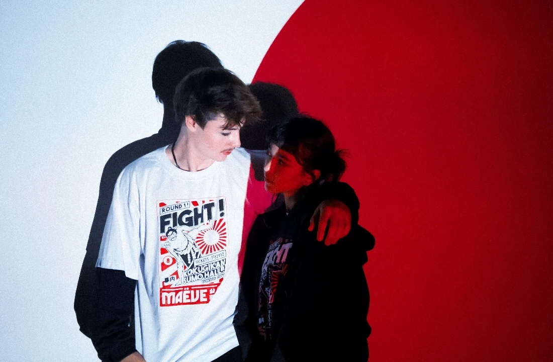
The practical difference in screen printing vs DTF is where complexity enters production. Screen printing apparel requires the artwork to be prepared for separations and press setup, while DTF printing creates a transfer that is later applied to the garment. That makes screen printing more attractive when a graphic becomes a stable product asset, while DTF can be more responsive when a brand is still testing what deserves a repeat order.
The comparison below is most useful when the same artwork, blank, and intended placement are being evaluated. Changing the garment, ink coverage, or placement can change the outcome.
| Decision point | Screen printing | DTF printing | What the brand should confirm |
|---|---|---|---|
| Artwork structure | Works well when the artwork can be planned into controlled color separations | Handles dense color variation, photo-like detail, and layered graphics more directly | Whether the visual can be simplified without losing its identity |
| Print hand | Can be tuned through ink, underbase, and artwork choices | Creates a heat-applied transfer layer | Whether the intended blank and graphic coverage still feel comfortable together |
| Early drop testing | Setup work may be disproportionate for an unproven graphic | Better suited to flexible low-inventory testing | Whether the design, colorway, and placement may change after launch |
| Repeat-order control | Strong when the approved separation and press standard are retained | Strong when the approved transfer, press settings, and garment remain controlled | Which variables will be locked before a reorder |
| Placement flexibility | Efficient for a repeated placement plan | Useful for varied graphic combinations and smaller placement changes | Whether sleeve, back, or oversized placements are part of the assortment |
The important point is not that one method is universally better. A front graphic built around bold shapes may become unnecessarily complicated if treated like a photographic print. Conversely, forcing a dense multi-color illustration into a simplified screen print can change edges, gradients, and tonal detail before production even starts.
Why screen setup changes the production decision
Screen printing depends on artwork separations, registration, underbase behavior, ink order, and the garment color beneath the print. Adobe’s screen-print artwork preparation guidance recommends outlining live text and organizing same-color elements to make separation work clearer. That is not merely a file-prep preference: missing fonts, ungrouped colors, or an unclear knockout can delay approval or create a proof that does not match the design team’s expectation.
Why DTF shifts rather than removes risk
DTF printing shifts much of the complexity into transfer preparation, powder application, curing, and heat pressing. Epson’s DTF Film Printing Guide describes the film, powder, heating, transfer, and post-press stages, while also noting that the correct conditions depend on the film, powder, fabric, ink amount, and equipment. A DTF sample should therefore be approved on the actual blank, not judged only from a transfer sheet or digital mockup.
When Does Screen Printing Make More Sense for Graphic Tees?
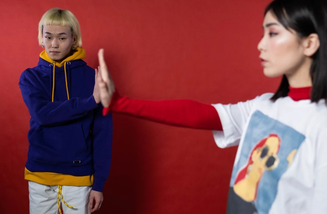
Choose screen printing when the graphic is intended to become a repeatable visual system rather than a short-lived artwork experiment. This is particularly relevant for custom graphic tees built around bold logos, limited-color illustrations, type-led graphics, or designs where the ink character is part of the streetwear printing concept.
A stable, low-color design gives the production team more room to control how ink sits on the fabric. It also gives the brand a clearer basis for approving an underbase, print order, and finished hand feel. The advantage is not simply lower cost at a larger volume. The larger advantage is that an approved print specification can become a repeatable production reference for future drops.
Select screen printing when the graphic can be designed for it
Screen printing is a strong choice when the artwork has deliberate color blocks, clear edge relationships, and limited tonal dependence. If a logo can be made with spot-color thinking instead of relying on fine photographic shading, it is more likely to retain its visual identity across reorders.
The common mistake is approving a digital file before asking whether it has been designed for separation. Complex raster art, subtle fades, and tiny reversed details can require extra treatment. Screen Printing Mag’s explanation of complex separations notes that complex gradients and raster elements may need artwork adjustments even when automated separation tools are involved. If the design team wants screen printing, it should be prepared to adjust artwork rather than assume the original social-media asset is production-ready.
Do not choose it just because the order is becoming larger
A larger order does not fix artwork that is unsuitable for screen printing. If the graphic relies on numerous soft transitions, highly detailed faces, or fine transparent effects, forcing it into a separation-based workflow may create a proof that is technically printable but visually unlike the intended artwork.
For a recurring logo tee, screen printing may be the more controlled option. For a new illustration that still needs visual iteration, the risk is not just setup time; it is approving a design compromise that the brand then has to carry into every reorder. Use custom apparel printing methods to compare the decoration route against the actual artwork, garment, and intended placement before committing to a repeat program.
When Is DTF the Better Choice for a New Streetwear Drop?

DTF is usually the more sensible route when the brand needs to test complex artwork without converting it into a simplified screen-print version. It is especially useful for early custom T-shirt drops, multi-color graphics, art-heavy capsules, and print on demand streetwear where inventory exposure matters more than building a permanent screen setup.
DTF can preserve dense visual information with fewer artwork constraints at the beginning of the product-development cycle. That does not mean it should be treated as a shortcut around quality control. The transfer’s feel, edge behavior, and visual relationship with the fabric still need approval on the chosen blank.
Use DTF when the artwork is still changing
A design with detailed color variation, collage elements, photographic components, or frequent colorway edits is usually better served by DTF during the testing stage. A brand can assess whether the graphic has commercial and creative value before investing effort in simplifying it for another route.
This is also where print-on-demand T-shirts can support low-inventory graphic testing. The decision should remain specific: use DTF for the artwork and launch conditions that need flexibility, not because every graphic tee should be treated as an on-demand item indefinitely.
A useful hypothetical example is a creator launching several illustrated tees with different back graphics and garment colors. If the artwork, placement, or colorway is likely to change after the first customer feedback cycle, DTF can reduce the pressure to finalize a separation plan too early. If one design later becomes the enduring flagship, that is the moment to reassess screen printing.
Do not use DTF without reviewing coverage and placement
A broad, dense DTF graphic can feel materially different from a small chest placement. This matters on streetwear blanks with heavier fabric, oversized cuts, vintage-wash finishes, or a deliberately soft hand. The risk usually appears when a brand judges the print only from the front view: the design may look strong on a hanger but feel restrictive across the chest or back when worn.
DTF is also not the right answer if the brand’s essential design language depends on a specific ink texture that a transfer layer cannot reproduce. Before approving, confirm the artwork dimensions, covered area, garment color, fabric surface, and whether the wearer will feel the graphic across a large movement zone. For DTF printing, a small adjustment in placement can be more valuable than reducing the artwork merely to make it fit a generic print area.
How Do Blank T Shirts and Placement Change the Result?
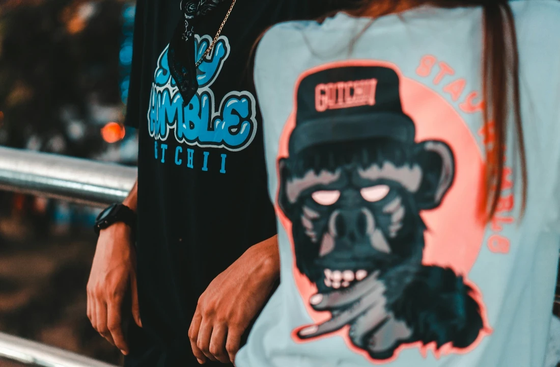
The blank is not a neutral carrier for a graphic. Blank t shirts change how a print looks, feels, and repeats because fiber composition, surface texture, garment dyeing, fabric weight, and fit all affect the visual relationship between the decoration and the shirt.
For streetwear graphic tees, select the blank before finalizing the decoration method. A large back graphic on a boxy, substantial tee creates a different product than the same artwork on a lighter, closer-fitting blank. GSM can help describe fabric weight, but it should not be treated as a universal quality signal or a fixed printing standard. The relevant question is whether the fabric surface, drape, and intended silhouette support the print coverage.
Match print coverage to fabric surface and fit
A smooth, stable fabric surface can make edges and color blocks look more controlled. A garment with a washed or textured appearance may make a perfectly clean digital mockup look too sharp, too flat, or visually disconnected from the garment character. For screen printing, that affects ink appearance and underbase decisions. For DTF, it affects how the transfer edge and surface contrast read against the blank.
Fit also changes placement. On an oversized tee, a small centered print can look accidental; on a narrower body, an oversized chest image can become uncomfortable or visually crowded. Placement should be approved on the graded garment size range, not only on a single sample size.
Build the garment decision into the brief
Brands choosing custom T-shirts for POD streetwear should submit the garment style, intended fit, color, artwork dimensions, and placement map together. “Front print” is not a sufficient production instruction if the artwork is meant to sit lower, span a wider chest zone, or align with a seam, pocket, sleeve, or back yoke.
A common error is changing blanks after the print has been approved. The new fabric surface or cut may change the apparent scale, hand, and placement even when the same production file is used. If the blank must change, treat it as a new approval condition. Do not assume that a print approved on one tee will reproduce the same product experience on another.
How Should Brands Compare Cost and Repeat-Order Risk?
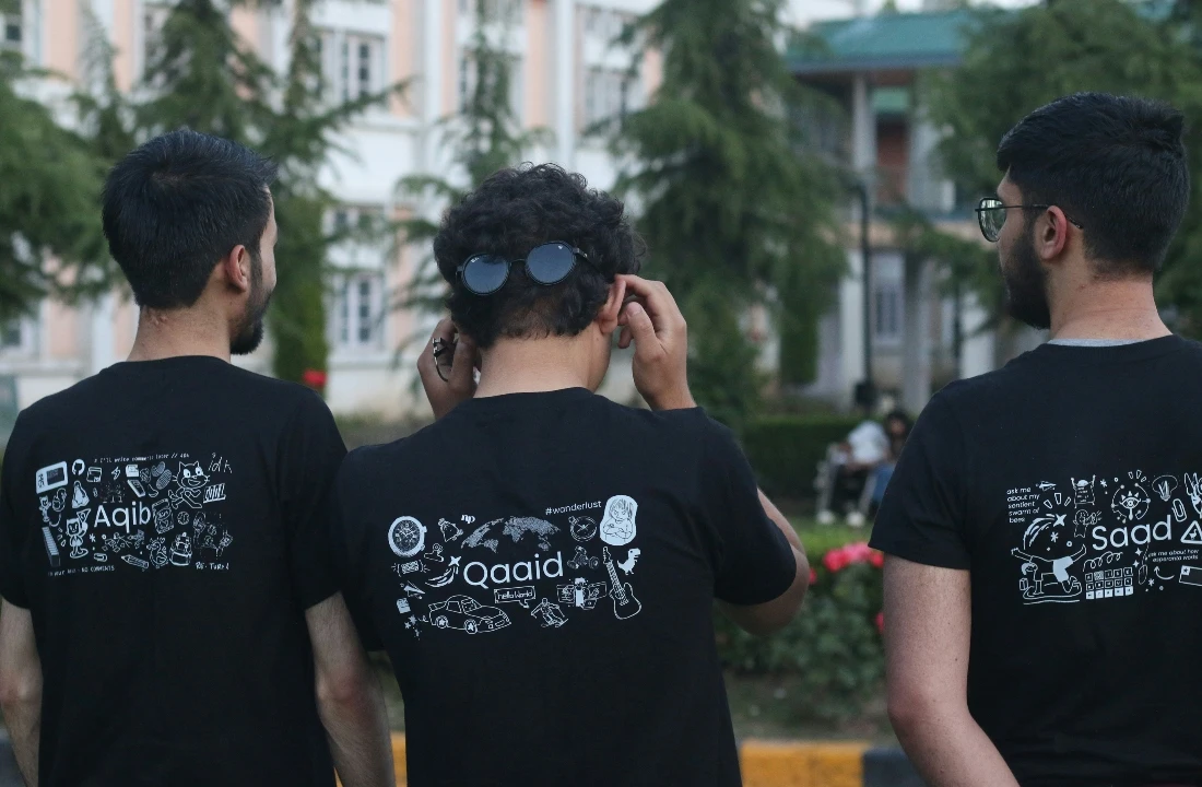
The right cost question is not “Which print is cheaper per tee?” It is “Which process gives this artwork and garment the lowest avoidable risk at this stage of the product line?” A production budget should account for blank selection, artwork preparation, print area, placement count, sampling, packaging needs, and the likelihood of a reorder—not merely the decoration charge.
For an unproven graphic, a lower setup burden may matter more than minimizing the unit cost. For a stable bestseller, repeat-order consistency and a preserved production standard may matter more than early-stage flexibility. The method should follow the decision stage.
Separate testing cost from long-term production cost
DTF can be useful when a brand needs to validate a complicated graphic with limited inventory. Screen printing can be useful when an approved design has settled into repeatable color and placement rules. These are different commercial moments, and comparing them as if they have identical requirements often creates poor decisions.
Use transparent custom apparel pricing to review the current relationship among garment choice, included print area, additional placement, shipping, and optional branding details. The production budget should also reserve room for a physical sample. A cheap first run is not economical if the artwork needs a correction after the order has already been produced.
Lock the variables before a reorder
Repeat-order consistency depends on a complete approved record: artwork version, garment SKU, fabric and color, print dimensions, placement measurements, decoration method, and approved sample. If any of these change, the brand should expect a new review rather than treating the reorder as automatic.
Screen printing is not suitable when the brand cannot lock the artwork or colors. DTF is not suitable when the brand approves only the visual image and ignores the transfer coverage, press result, and fabric feel. In either case, the risk usually appears after launch, when a product page promises a familiar tee but the next batch feels or looks materially different.
What Must a Sample Approval Prove Before Production?
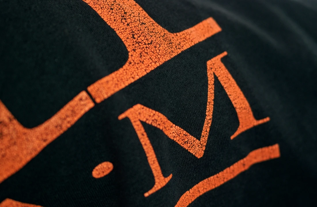
A sample should prove that the chosen method works on the real streetwear product, not just that the artwork can be printed. The approval standard needs to cover visual accuracy, print placement, hand feel, edge quality, garment condition, and the result after the relevant care assessment.
Durability should be assessed through a defined test approach rather than vague promises about wash performance. AATCC’s overview of colorfastness test methods identifies laundering, crocking, water, perspiration, and light as distinct colorfastness evaluations. That distinction matters because a single successful visual check does not prove every use condition.
Approve the product rather than the isolated graphic
The sample should be viewed flat, worn, and handled. Check whether the placement works with the fit, whether the blank color changes the artwork’s perceived contrast, and whether a large print changes how the garment drapes. For screen printing, inspect registration, opacity, and unwanted underbase visibility. For DTF, inspect transfer edges, coverage, and how the applied graphic responds when the fabric moves.
If a design relies on a vintage, distressed, or worn-in look, write that requirement into the artwork brief. Do not assume that a standard production file will automatically create the intended finish.
Create an approval package that production can follow
A useful approval package includes the final artwork file, placement diagram, garment specification, print dimensions, color references, approved sample images, and any care or handling requirements. Brands using custom apparel services should also state whether custom labels, hang tags, packaging, or other branding elements are part of the same production decision.
The common failure is approving a mockup while leaving placement and garment details open. That creates room for a technically correct print that still misses the streetwear product vision. Only approve once the brand can say which exact blank, which print route, which placement, and which artwork version define the order.
Conclusion
Screen printing vs DTF should follow the life stage of the streetwear graphic tee. Choose screen printing when a design has controlled colors, a settled placement, and a realistic repeat-order plan. Choose DTF when complex artwork, lower inventory exposure, and flexible launch testing matter more than building a long-term separation workflow.
Before releasing a drop, first rule out the avoidable risks: an unapproved blank change, artwork that has not been checked for its chosen process, a large print that has not been worn, or a reorder without a locked specification. Then submit the artwork file, garment type, fabric choice, intended fit, quantity, placement map, target delivery date, and branding requirements to contact Cloprod for custom apparel production. That gives the production discussion enough detail to recommend a method for the actual product rather than a generic tee.
FAQ
Is screen printing better than DTF for streetwear?
Screen printing is usually stronger for a stable, color-controlled graphic that will be repeated on the same blank and placement. DTF is usually stronger for complex multi-color artwork or a drop that still needs low-inventory testing. Neither method is suitable when the brand has not approved the artwork on the intended garment.
Can DTF work for large back graphics?
It can, but the approval should focus on coverage and wearability. A large back graphic may look effective in a flat product image while creating a noticeably different hand or drape on the body. Confirm the final dimensions, blank surface, and placement on a physical sample.
What artwork files should a brand send for screen printing?
Provide the final artwork with clear color intent, outlined text where applicable, transparent background requirements, and placement information. If the artwork includes gradients, small details, or complex raster elements, request a separation review before treating the file as ready for screen printing apparel.
Should a brand use the same print method for every graphic tee?
Not necessarily. A logo tee, an illustrated capsule graphic, and a low-inventory launch can have different artwork and supply requirements. The method should be selected by print coverage, fabric surface, artwork complexity, expected reorder behavior, and the degree of change still expected after sampling.